To me, usability means making sure that everything is obvious, self-explanatory and easy to use. I often see things in the physical world which make me wonder what the hell the designer was thinking. Here’s a classic example:
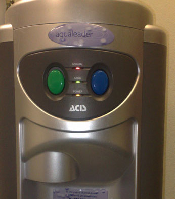
This is one of The Werks‘ watercoolers. So, what’s the difference between the green button and the blue button? I don’t know.
Normally, blue taps signify cold water. So what about the green button? What does green signify? Is it hot? Why green?
Whichever button you press, you get cold water. So why two buttons? Why no explanation of what the buttons do? And why not stick to the convention of:
Blue = cold
Red = hot ?
This is a good example of bad usability, which leaves people with a vague sense of confusion. Obviously, giving people a sense of confusion is a bad thing.
Good web copy (and design) leaves no room for confusion.

Haha – that’s a good one. But actually – one of the buttons is for really cold water (probably the blue) and the other one is for water at the temperature as it is in the container. (I know – this is not the real real point in this blog, but I just wanted to let you know that I’ve had the same speculations with our water cooler).
Have a nice day.
Comment by Lotte — April 23, 2009 @ 7:02 am
I’ve often wondered that too.
Comment by Simon — April 27, 2009 @ 3:52 pm